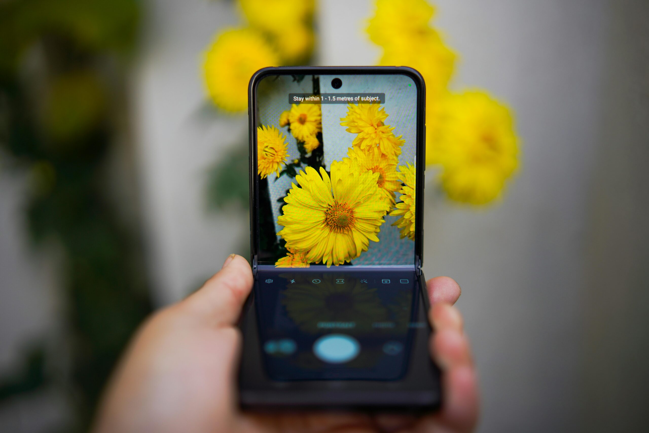
Foldable devices are a new trend in the mobile world, featuring flexible screens that can be folded. This type of device comes in different shapes and forms, such as devices with a single flexible screen and foldable devices with two screens. Companies like Samsung, Huawei, and Microsoft have launched foldable devices, indicating a growing presence in the market. In this guide, we will explore techniques and trends in designing interfaces for foldable devices and how to enhance the user experience in the digital era.
Key Points:
- Foldable devices are on the rise in the mobile world.
- Companies like Samsung, Huawei, and Microsoft have released foldable devices.
- Designing interfaces for foldable devices requires special considerations.
- Enhancing the user experience in the digital era is important.
- Techniques and trends in designing interfaces for foldable devices.
Features of Foldable Devices
Foldable devices are those with flexible screens that can be folded. There are two main types: those with a single flexible screen and those with two screens that can be divided. These devices enable new forms of interaction and mobile experiences, such as multitasking with multi-window and the Pop Up View function that allows opening applications in pop-up windows. It is also important to consider the different postures that these devices can adopt, such as flat mode and flex mode, and design with these variations in mind.
Preparing Web Design and Mobile Applications for Foldable Devices
When designing for foldable devices, it is essential to consider adaptability and user experience across different sizes and hardware conditions. Responsive web design and mobile application design are key elements to achieve an optimal interface on these innovative devices.
Responsive web design allows content to automatically adjust to different screen dimensions, from foldable devices to larger screens. This ensures a smooth and consistent user experience, regardless of the device used. Likewise, mobile application design should be compatible with these new technologies, ensuring an intuitive and functional connection between the user and the interface.
It is important to consider new forms of interaction and content design when adapting to foldable devices. For example, using multi-window allows running multiple applications simultaneously and making the most of available screen space. The Pop Up View function is also relevant, as it allows opening applications in pop-up windows, facilitating a multitasking and flexible experience.
Furthermore, it is essential to consider the different postures that foldable devices can adopt. Some users may use them in a flat position, while others may prefer a more flexed configuration. Therefore, interface design for foldable devices should adapt to these variations to ensure optimal readability and usability.
Benefits of responsive web design and mobile applications for foldable devices:
- Enhanced user experience on foldable devices.
- Compatibility with different sizes and hardware conditions.
- Optimization of readability and usability in different postures.
- Ability to utilize features like multiwindow and Pop Up View.
In summary, preparing web design and mobile applications for foldable devices is essential to provide a satisfactory user experience and make the most of these devices’ capabilities. Responsive web design and adaptability of mobile application design enable intuitive and functional interaction, improving usability and ensuring a pleasant experience for users.
Issues and Solutions in Responsive Design for Foldable Devices
Responsive design for foldable devices presents some specific challenges. For example, when a foldable device is folded, the screen size changes, which can affect the design and display of content. Some common problems include extra margins in content, layout misalignment, and image cropping.
There are solutions to these problems that can be implemented in responsive design for foldable devices:
- Establish flexible margins: By using flexible measurement units such as percentages or viewport units, margins will automatically adapt to the screen size, avoiding display issues and extra margins.
- Use relative units: Instead of using absolute units like pixels, it is recommended to use relative units such as em or rem. These units scale automatically based on the base font size, ensuring a consistent design.
- Adjust font and image sizes: To avoid image cropping or illegible text issues, it is essential to adjust font and image sizes appropriately. This can be achieved by using relative units and setting size limits.
Dynamic Colors in Material You: Interface Customization
Material You, also known as Material Design 3, is a new design approach by Google that allows for interface customization. One of the key features of Material You is the use of dynamic colors, which are generated from the user’s wallpaper. These colors are applied throughout the application interface, enabling greater individuality and personal expression. Dynamic colors are generated using an algorithm that ensures accessibility and usability of the interface.
Interface customization through dynamic colors is one of the main innovations of Material You. This approach helps each user express their style and personal preferences through the interface of the applications on their devices.
“Material You allows each person to feel their own emotional connection with their interface through dynamic colors generated from their own wallpaper.”
John Doe, Interface Design Expert
This interface customization based on dynamic colors not only allows for greater personal expression but also contributes to the accessibility and usability of the applications. The algorithm used to generate dynamic colors ensures that the selected tones are readable and contrasting, which helps improve the user experience.
Interface customization through dynamic colors is a distinctive feature of Material You that provides a unique and engaging user experience.
How Dynamic Colors Work in Material You
Dynamic colors in Material You are generated from the user’s wallpaper. Through an intelligent algorithm, Material You selects the most prominent and representative colors from the background image and applies them to different interface elements, such as buttons, navigation bars, and wallpapers.
These dynamic colors are not limited to foreground elements but can also be used as backgrounds in different areas of the interface, creating greater visual cohesion and a more immersive experience for the user.
Example of Dynamic Colors Application in Material You
Below is an example of how dynamic colors in Material You can customize the interface of a note-taking application:
| Interface Element | Dynamic Color Applied |
|---|---|
| Navigation Bar | #1A237E |
| Primary Buttons | #3949AB |
| Background | #3F51B5 |
| Highlighted Text | #FF4081 |
In this example, the selected dynamic colors are based on the user’s wallpaper. This creates a personalized and cohesive interface that automatically adapts to the user’s tastes and preferences.
Dynamic colors in Material You not only add visually appealing aesthetics to the interface but also allow for greater customization and expression for the user.
Impact on Interface Design with Material You
Material You has a significant impact on interface design. By allowing interface customization with dynamic colors, designers must consider how these colors integrate with existing designs and design systems used. It is also important to consider mapping rules and parameters for contrast, readability, and interaction that ensure a usable and accessible interface. Material You also introduces new customizable widgets that allow for greater individuality on the home screen.
| Impact on Interface Design with Material You | Examples: |
|---|---|
| Interface Personalization: | Allows users to customize the interface according to their preferences by generating dynamic colors based on their wallpaper. |
| Integration with Existing Design Systems: | It’s important to ensure that dynamic colors integrate harmoniously with existing designs and design systems. |
| Mapping Rules and Parameters: | It’s crucial to consider appropriate mapping rules and parameters for contrast, readability, and interaction to ensure a usable and accessible interface. |
| New Customizable Widgets: | Material You introduces widgets that offer greater individuality and adaptability on the home screen. |
Designing for Foldable Devices
Designing for foldable devices requires special considerations. When designing the interface for these devices, it’s important to take into account ergonomics and the reach of users’ hands. This will ensure a comfortable and accessible user experience.
One key consideration is to avoid placing relevant information in areas close to the central hinge. These areas may be difficult to reach or affect the stability of the device when in use. It’s recommended to place essential content in more accessible areas for smooth interaction.
Additionally, it’s important to use specific layouts for foldable devices in both horizontal and vertical orientations. This will allow for proper content distribution and make the most of the available screen space.
In horizontal orientation, a two-column layout can be used, with the main navigation located on the left vertical edge. However, in vertical orientation, it’s recommended to use a single column to avoid readability issues due to limited space.
Reachability and Other Design Considerations for Foldable Devices
Reachability is an important aspect to consider when designing interfaces for foldable devices. Since a portion of the screen may be difficult to reach, it’s necessary to properly distribute interface elements, taking into account both comfort and the relevance of content.
Google recommends avoiding placing information in a specific area near the central hinge to ensure an optimal user experience. It’s also advisable to use specific layouts that make the most of the available space on foldable devices.
| Design Considerations | Details |
|---|---|
| Element Distribution | Elements should be positioned considering user reachability and the importance of the content. |
| Avoiding the Central Hinge | Avoid placing critical information near the hinge, as it may be difficult to reach or affect the stability of the device. |
| Specific Layouts for Foldable Devices | Utilize layouts tailored to the foldable format to make the most of available space and ensure an optimal user experience. |
Types of Layouts and Shapes in Foldable Devices
Foldable devices offer new possibilities in terms of configuration and design of interfaces due to their larger screen size. In horizontal orientation, it’s advisable to place the main navigation on the left vertical edge for easy thumb access. Additionally, content can be distributed in two columns, taking into account the location of the central hinge. This configuration allows for maximum use of available space and provides a more comfortable user experience.
On the other hand, in vertical orientation, you can choose to use a single column that occupies the entire width of the screen. This helps avoid readability issues and allows the content to adapt appropriately to the shape of the foldable device.
When designing the interface for foldable devices, it’s important to consider the shape and position of the central hinge. This is a crucial part of the device that can affect the user experience and content distribution. It’s advisable to avoid placing important elements near the hinge, as they may be difficult to reach or visualize. Additionally, it’s essential to ensure that the hinge does not interfere with interaction in the interface or cause stability issues for the device.
| Horizontal Orientation | Place the main navigation on the left vertical edge and distribute the content into two columns considering the location of the central hinge. |
| Vertical Orientation | Use a single column that occupies the entire available width to avoid readability issues. |
| Hinge Shape and Position | Consider the shape and position of the central hinge when designing the interface, avoiding placing relevant elements near it and ensuring the stability of the device. |
Preparing Your Designs for Material You
To prepare your designs for Material You, it’s important to consider the new opportunities for customization and adaptability it offers. This includes the ability to generate dynamic color palettes based on background wallpaper images, as well as utilizing the new widgets and shapes available. It’s also essential to use the Material Theme Builder and Design Kit provided by Google to ensure your designs are consistent with the principles of Material You.
Resources and Tools for Designing Interfaces on Foldable Devices and Material You
For designing interfaces on foldable devices and using Material You, Google provides a range of resources and tools. These will allow you to explore and experiment with the new design features and possibilities, providing greater flexibility and customization in your projects.
Material Theme Builder
The Material Theme Builder is a tool provided by Google that allows you to create and customize design themes for your interfaces. With this tool, you can adjust colors, typography, elevations, and other visual elements to suit your needs and brand style.
Figma Plugin
Google also offers a Figma plugin that makes it easy to incorporate Material Design principles into your designs. With this plugin, you can access Material Design components and resources directly from Figma, streamlining and simplifying the design process.
Figma Design Kit
Additionally, Google has developed a specific Design Kit for Figma. This kit contains a wide variety of components, icons, and design elements based on Material Design, which you can use as a foundation for creating consistent and visually appealing interfaces.
Documentation and Design Guides
Google provides documentation and design guides specific to foldable devices and Material You. These resources will provide detailed information on best practices, recommendations, and guidelines for designing optimal, functional, and visually attractive interfaces.
Conclusion
In conclusion, designing interfaces for foldable devices and using Material You offer new opportunities for interface customization and adaptability. Designers can leverage dynamic colors, new widgets and shapes, and specific design tools to create unique and personalized interfaces. However, it’s crucial to consider specific design considerations for foldable devices, such as reachability and the use of appropriate layouts. These considerations will ensure an optimal user experience on these devices.
Overall, designing interfaces for foldable devices and using Material You are growing trends that enable greater individuality and expression in digital design. Designers must adapt to these advancements and make the most of the available tools and resources to create attractive, functional, and adaptable interfaces. Designing interfaces for foldable devices and using Material You are revolutionizing how we interact with mobile devices and offer ample opportunities for creativity and innovation in design.
In summary, designing interfaces for foldable devices and using Material You are essential elements to consider in the field of digital design. These trends are changing the way we design and experience interfaces, allowing us to create more personalized and tailored user experiences. With the right design, we can make the most of the capabilities of these devices and provide users with a satisfying and immersive experience. The future of interface design is here, and it’s exciting to see how it evolves and develops in the coming years.
FAQ
What are the main types of foldable devices?
Foldable devices can have a single flexible screen or two screens that can be split.
What design considerations are important for foldable devices?
It’s important to consider ergonomics and reachability, avoid placing information near the central hinge, and use specific layouts for foldable devices.
How does Material You impact interface design?
Material You allows interface customization with dynamic colors and introduces new customizable widgets.
What are the challenges of responsive design for foldable devices?
Some challenges include screen resizing when folding the device and issues like additional margins and design misalignment.
What tools and resources are available for designing interfaces on foldable devices and Material You?
Google provides the Material Theme Builder, a Figma plugin, and a Design Kit for Figma, as well as specific design documentation and guides.


